
Checkout Page Optimization: 12 Ways to Stop Losing Sales
January 28, 2024 | 4,224 views | 12 min. read time
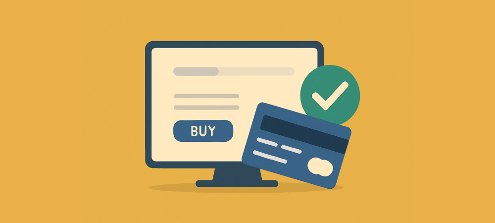
The checkout page is where sales are won or lost. A shopper who reaches it has already decided they want to buy — so every visitor who abandons here is a sale you were moments away from making. Small problems in the checkout, from too many fields to a missing payment option, quietly cost stores a fortune. This guide covers 12 practical ways to optimise your checkout page and stop losing sales at the very last step.
Why the checkout is so important
By the time someone reaches checkout, you have already done the hard work of attracting them, convincing them, and getting them to add to cart. Losing them now wastes all of that effort and expense. Yet checkout is exactly where friction, doubt, and surprises do the most damage, because the shopper is being asked to commit money and hand over personal details.
That makes checkout optimisation one of the highest-return things you can do. Every improvement here works on your most valuable visitors — people ready to pay — so even a small lift in completion translates directly into revenue. The 12 changes below remove the common reasons people abandon at the final step.
1. Offer guest checkout
Forcing shoppers to create an account before buying is one of the biggest causes of checkout abandonment. Many people simply do not want another login, and being blocked by a registration wall pushes them away. Let customers check out as guests, and offer the option to save their details after the purchase, so account creation becomes a benefit rather than a barrier.
2. Keep the form short
Every field you ask for is a small chance to lose someone. Request only what you genuinely need to complete the order, and remove anything optional or nice-to-have. A shorter form feels faster and less intrusive, and it consistently lifts completion rates compared with a long, demanding one.
3. Show a clear progress indicator
If checkout has multiple steps, tell shoppers where they are and how much is left. A simple progress bar reduces the uncertainty and impatience that make people give up midway. Knowing the finish line is close keeps them moving through to payment.
4. Be transparent about the total
Nothing kills a sale at checkout like an unexpected cost appearing at the last moment. Show shipping, taxes, and any fees as early as possible, so the total the shopper sees matches what they expected. Transparency here prevents the sticker shock that sends people fleeing from the final step.
5. Offer multiple payment options
Shoppers expect to pay their way. If their preferred card, digital wallet, or buy-now-pay-later option is missing, some will abandon rather than switch methods. Supporting a range of trusted payment options removes a needless reason to lose the sale at the final click.
6. Add trust signals at the point of payment
Handing over card details is the moment fear of fraud peaks. Security seals, familiar payment logos, and a visible privacy assurance placed near the payment fields reassure shoppers that their information is safe. That small reassurance recovers buyers who would otherwise hesitate and close the tab.
7. Use autofill and smart defaults
The less typing you demand, the smoother the checkout. Enable address autofill, detect the card type automatically, and pre-fill sensible defaults wherever you can. Every keystroke you save reduces effort and friction, which keeps momentum from cart to confirmation.
8. Handle errors gracefully
Confusing or harsh error messages frustrate shoppers into leaving. Validate fields in real time, explain clearly what went wrong and how to fix it, and never make someone re-enter everything because of one small mistake. A forgiving, helpful form keeps people calm and moving forward.
9. Optimise for mobile
A large and growing share of purchases happen on phones, and a checkout that is cramped, fiddly, or hard to tap loses much of that traffic. Use large tap targets, mobile-friendly keyboards for each field, and a layout that works on a small screen. A checkout that is effortless on mobile captures sales a desktop-only design quietly loses.
10. Make it fast
Speed matters most at the final step, where impatience and second thoughts are highest. A slow-loading checkout gives doubt time to creep in and tests the patience of a ready buyer. Trim anything that slows the page so shoppers can complete the purchase quickly, before hesitation sets in.
11. Reassure with policies and social proof
A visible return policy, a money-back guarantee, and a note that others buy safely here all lower the perceived risk of completing the order. Reassurance placed right at checkout answers the last-second “what if this goes wrong?” doubt. Real-time signals of genuine recent purchases, such as those from Proofly, can reinforce that other people are buying with confidence right now.
12. Remove distractions
The checkout should have one job: completing the purchase. Strip out navigation menus, unrelated links, and competing offers that give a ready buyer a reason to wander off. A focused, distraction-free checkout keeps attention on the single action that matters. A shopper on the payment step should have exactly one clear path forward and no tempting exits pulling them away.
A worked example: fixing the biggest leak
Consider a store losing most of its shoppers on the checkout’s account-creation step. The analytics show a sharp drop the moment people are asked to register. The owner enables guest checkout and shortens the form from twelve fields to six. Over the following weeks, checkout completion rises noticeably, with no other change to traffic or pricing.
That is the pattern to follow. Rather than applying all 12 fixes at once, look at where shoppers actually abandon, address that step first, and measure the result. Checkout optimisation is most powerful when it is aimed at the specific point where your ready buyers are slipping away.
It also helps to test each change rather than assume. Because checkout handles your most valuable, ready-to-buy visitors, even a small verified improvement here pays off immediately, and a series of them compounds quickly. Fix the biggest leak, confirm with your numbers that it helped, then move to the next — and your completion rate climbs steadily rather than randomly.
Frequently asked questions
Why do people abandon at checkout?
Usually because of unexpected costs, forced account creation, a long or confusing form, missing payment options, or security concerns. Most of these are straightforward to fix.
Should checkout be one page or several steps?
Either can work well if it is clear and short. A single-page checkout feels fast; a multi-step one with a progress bar can feel organised. What matters most is removing friction and unnecessary fields.
Does guest checkout really help?
Yes. Forcing account creation is a leading cause of abandonment, so letting people buy as guests — and offering to save details afterwards — reliably lifts completion.
Conclusion
Your checkout page handles your most valuable visitors: people ready to pay. Do not lose them to avoidable friction. Offer guest checkout, keep forms short, be transparent about costs, support the payment methods people want, reassure them with trust signals, and make the whole thing fast and effortless on mobile. Find where shoppers abandon, fix that step first, and measure the result — and you will stop leaving sales on the table at the very last moment.
Use FOMO on your website!
Install Proofly in a few clicks to take advantage of FOMO on your website today! No creditcard required.
Get started now!Always be up-to-date with Proofly.
The amount of people using your website on mobile devices rapidly increases. Make sure your websites are fully responsive!
55.521%
Mobile devices
This might be useful for you too:
FOMO Statistics: The Numbers Behind the Psychology
The fear of missing out is more than a buzzword — it is a documented psychological effect that shapes real spending decisions. Marketers lean on it constantly, from “only 3 left” badges to countdo...
2024-11-02
Read more

Review Schema Markup: How to Get Your Ratings Into Search and AI Answers
You have great reviews — but do search engines and AI assistants know it? Star ratings that show up directly in Google results, and the ratings that AI answers cite when recommending products, do not happen by...
2026-06-06
Read more

Social Proof for Course Creators, Coaches and Membership Sites
Selling a course, a coaching program, or a membership is selling a promise: that you can help someone change, learn, or achieve something. That makes trust the whole game — and it makes social proof both more...
2025-11-20
Read more
Ready to use social-proof too?
You can use Proofly within 5 minutes on your own website absolutely free!
Set-up in 5 minutes Over 25,000 satisfied customers No monthly subscription
4.7/5 customer satisfaction
Get started now!
a few thousand others...