
Landing Page Optimization: 20 Elements That Convert
October 9, 2023 | 4,050 views | 13 min. read time
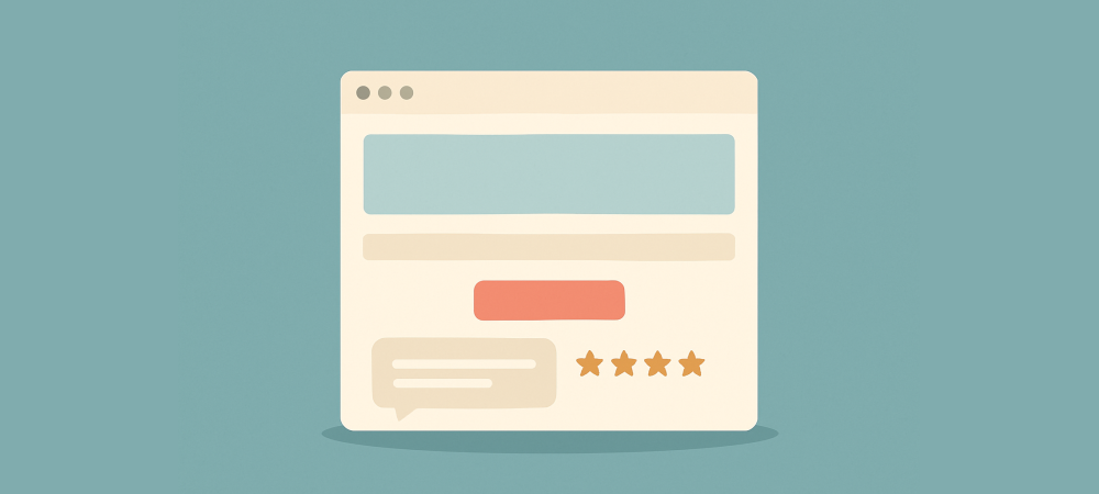
A landing page has one job: convince a visitor to take a single action. Unlike a homepage that tries to do everything, a good landing page is a focused, optimised path toward one goal — and getting its elements right can dramatically lift conversions. This guide breaks down 20 elements that make landing pages convert, so you can build pages that turn clicks into customers instead of bounces.
What makes a landing page convert
Every element on a high-converting landing page serves the same purpose: reduce friction and doubt while moving the visitor toward one clear action. Anything that distracts from that goal — extra links, competing offers, unnecessary fields — works against you. The best landing pages are ruthlessly focused.
The 20 elements below fall into a few themes: clarity, persuasion, trust, and ease of action. You will not need every one on every page, but the more of these you get right, the harder your page works. Think of them as a checklist to audit any page you want to improve.
Clarity elements
- A clear, benefit-led headline. The first thing visitors read must instantly say what they get. A sharp headline that promises a real benefit is the single most important element on the page.
- A supporting subheadline. A second line that expands on the headline adds detail and reassurance without cluttering the main promise.
- A focused hero section. The area above the fold should communicate the offer, show it visually, and present the action, all without making the visitor scroll to understand what this is.
- One single goal. A landing page should ask for one thing. Multiple competing actions split attention and lower conversion on all of them.
- Benefit-focused copy. Throughout the page, lead with what the visitor gains rather than dry features. People act on outcomes they want, not specifications.
- Scannable structure. Short paragraphs, clear subheadings, and bullet points let visitors absorb the page at a glance, since most people skim rather than read.
Persuasion and trust elements
- Social proof. Testimonials, reviews, and ratings show that others acted and were glad. Place them near the decision point to reassure hesitant visitors.
- Real-time activity. Signs that others are acting right now add live credibility. Tools like Proofly can show genuine recent sign-ups or purchases from one snippet.
- Trust badges. Security seals, payment logos, and recognised endorsements reduce the fear of handing over details or money.
- A guarantee. A money-back or satisfaction guarantee lowers the perceived risk of saying yes and often tips undecided visitors over the line.
- Specific numbers and results. Concrete figures — customers served, results achieved — are more believable and persuasive than vague claims.
- Objection handling. Anticipate the reasons someone might hesitate and answer them on the page, so doubts do not go unaddressed.
Action elements
- A prominent call-to-action button. The action button should stand out with high contrast and sit where the eye naturally lands, repeated down the page as needed.
- Action-oriented button copy. Specific, benefit-led wording like “Start my free trial” beats a generic “Submit.” The button should describe what happens next.
- A short, simple form. Every extra field costs conversions. Ask only for what you genuinely need, since a shorter form almost always converts better.
- Directional cues. Subtle visual pointers — arrows, imagery, whitespace, a person’s gaze — guide the eye toward the call to action.
- Minimal distractions. Remove or reduce navigation and outbound links so the only obvious path is the one you want the visitor to take.
Experience elements
- Fast load speed. A slow landing page loses visitors before they read a word. Speed is a conversion factor, not just a technical nicety.
- Mobile optimisation. Most visitors arrive on phones, so the page must look and work perfectly on small screens, with tappable buttons and readable text.
- Generous whitespace. Clean spacing focuses attention on what matters and makes the page feel trustworthy and easy, rather than cramped and overwhelming.
How to put it together and improve
You do not need to perfect all 20 elements before launching. Start with the essentials — a strong headline, a clear single action, social proof, and a fast, mobile-friendly, distraction-free layout — then refine from there. A page that nails those fundamentals already converts far better than a cluttered one that tries to do everything.
From there, test your way to better results. Change one element at a time — the headline, the button, the placement of social proof — and compare conversion before and after. Landing page optimisation is an ongoing process of small, measured improvements, and each verified win compounds into a page that steadily earns you more customers from the same traffic.
Why focus beats features
The single biggest difference between a landing page that converts and one that does not is usually focus. Consider a common mistake: a page promoting one offer that also carries a full site menu, links to other products, a newsletter box, and three different buttons. Each addition feels harmless, but together they scatter the visitor’s attention and quietly lower the conversion rate on the one action that matters.
Now strip that same page back to essentials — one headline, one supporting line, a few benefit bullets, social proof, and a single prominent button repeated as you scroll. The visitor has nowhere to wander and one obvious thing to do. Again and again, this kind of ruthless simplification outperforms the busier version, because a landing page rewards subtraction more than addition.
Match the page to the ad that sent them
An often-overlooked element is message match: the landing page should continue the exact promise of the ad, email, or link that brought the visitor there. If someone clicks an ad for a specific product or offer and lands on a generic homepage, the disconnect creates doubt and they bounce. When the headline and imagery mirror what they just clicked, the page feels like the right place and momentum carries them forward.
This is why dedicated landing pages, tailored to each campaign, convert so much better than sending all traffic to one general page. The tighter the match between the promise that earned the click and the page that receives it, the fewer visitors you lose in the gap between the two.
Frequently asked questions
What is the most important element on a landing page?
A clear, benefit-led headline paired with one focused call to action. If visitors instantly understand what they get and what to do, the page is already ahead of most.
How many calls to action should a landing page have?
One goal, though the same call to action can be repeated down the page. Multiple competing actions split attention and lower conversion across the board.
Should a landing page have site navigation?
Usually not. Removing navigation and outbound links keeps visitors focused on the single action, which is why dedicated landing pages often convert better than general pages.
Conclusion
A landing page converts when every element pulls in the same direction: a clear headline and single goal, persuasive benefit-led copy, genuine social proof and trust signals, an obvious call to action, and a fast, focused, mobile-friendly experience. Build around these 20 elements, cut anything that distracts, and keep testing — and your landing pages will turn far more of your hard-won clicks into customers.
Increase conversions for free?
Get started with conversion-boosting social-proof widgets totally free! No creditcard required.
Get started now!Always be up-to-date with Proofly.
The amount of people using your website on mobile devices rapidly increases. Make sure your websites are fully responsive!
55.521%
Mobile devices
This might be useful for you too:

5 Ways to Boost Creativity in Your Marketing
Creativity is what makes marketing memorable, but it rarely arrives on demand. The good news is that creative thinking is a skill you can deliberately strengthen, not a gift some people have and others lack. Here ar...
2021-11-14
Read more

Exit-Intent Popups: How to Recover Abandoning Visitors
On average, most people who land on a website leave without doing anything — no purchase, no sign-up, no second visit. For every visitor you worked hard to attract, that is a wasted click. Exit-intent popups...
2023-01-02
Read more
WiserNotify Alternatives: 7 Options Compared
WiserNotify is a capable social proof and notification tool with a loyal following, but it is not the right fit for everyone. Maybe you want to escape a subscription that scales with your traffic, or you need someth...
2025-08-23
Read more
Ready to use social-proof too?
You can use Proofly within 5 minutes on your own website absolutely free!
Set-up in 5 minutes Over 25,000 satisfied customers No monthly subscription
4.7/5 customer satisfaction
Get started now!
a few thousand others...