
When to Show a Popup: Best Timing for Discounts and Offers
August 7, 2026 | 1,005 views | 12 min. read time
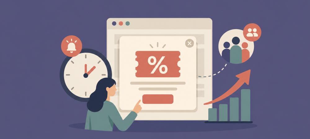
A discount popup can rescue a sale or send a visitor straight for the back button — and the difference is almost always timing. Show it too early and it feels pushy; show it too late and the visitor has already gone. This guide breaks down the main popup triggers, the best moment to show a discount, and how to test your way to the sweet spot.
1. Why timing makes or breaks a popup
Popups have a bad reputation, but the format is not the problem — interruption at the wrong moment is. A visitor who just landed has no context and no intent yet, so a popup that blocks the page in the first two seconds reads as an obstacle. The same offer, shown once the visitor is engaged or about to leave, reads as help.
Timing is also what keeps you on the right side of search engines and user experience. Intrusive popups that cover the main content immediately on arrival can hurt mobile usability and rankings. Trigger them on intent instead, and you keep both the conversions and the good standing.
The goal is simple: show the offer at the moment it is most useful and least annoying. To do that, you need to understand your trigger options.
2. The main popup triggers
Modern tools let you fire a popup on several signals. The ones that matter most:
- Time on page (delay). Wait a set number of seconds before showing anything. A short delay filters out instant bouncers and gives the visitor a moment to orient. Ten to twenty seconds is a common starting point.
- Scroll depth. Trigger once someone scrolls, say, halfway down the page. Scrolling is a strong signal of genuine interest — the visitor is reading, not just passing through.
- Exit intent. Detect when the cursor moves toward the back button or browser bar on desktop and show the offer as a last-chance nudge. This is the classic moment for a discount because the alternative is losing the visitor entirely.
- Pages viewed. Show the popup only after a visitor has seen two or three pages, so it reaches people who are clearly browsing with intent.
- Inactivity. Trigger after a period of no scrolling or clicking, which can signal hesitation or distraction.
The best campaigns combine a couple of these — for example, exit intent but only after the visitor has spent some time on the page — so the popup reaches engaged visitors at a natural decision point.
3. The best timing for a discount popup
Discounts are a special case because they cost you margin. You do not want to hand a code to someone who was going to buy anyway. That changes the ideal timing:
- Exit intent is the safest default. Offering a discount as the visitor tries to leave targets the people you would otherwise lose, not the ones already heading to checkout.
- Pair it with engagement. Combine exit intent with a minimum time on page or scroll depth so the offer only reaches visitors who showed real interest first.
- On mobile, lean on delay and scroll rather than exit intent, which is harder to detect reliably on touch devices. A popup after meaningful scrolling works well.
- Respect the cart. Someone actively in checkout rarely needs a distraction — target product and category pages, not the final payment step.
Done this way, a discount popup becomes a recovery tool for abandoning visitors instead of a margin leak on customers who were already sold.
4. Match the timing to the goal
Not every popup is a discount, and different goals call for different timing:
- Email capture: a short delay or a scroll trigger works well — give the visitor a taste of your content before you ask for an address.
- Discount or coupon: exit intent plus engagement, as above.
- Urgency and countdowns: show these on product pages once a visitor is clearly considering an item, so the scarcity feels relevant rather than manufactured.
- Welcome or announcement: a brief delay so it does not collide with the page loading.
Thinking in terms of “what do I want this visitor to do, and when are they most ready to do it?” will get you better timing than any fixed rule.
5. Mistakes that get popups ignored
A few timing errors show up again and again:
- Firing instantly on load, before the visitor has seen anything worth staying for.
- Showing the same popup on every page, every visit, with no frequency cap — which trains people to dismiss it on reflex.
- Stacking multiple popups so they compete for attention.
- Ignoring mobile, where an ill-timed full-screen popup is especially disruptive.
Set a sensible frequency cap, make the popup easy to close, and never show it again to someone who already converted. Good timing is as much about restraint as it is about triggers.
6. A worked example: recovering abandoning visitors
Timing is easiest to appreciate with real numbers, so walk through a typical exit-intent discount. Imagine a product page that gets 5,000 visitors a month and converts at 2%, for 100 orders. That also means about 4,900 people leave without buying — and a good share of them are not lost causes, just visitors who were not quite convinced.
Now add a discount popup triggered only on exit intent, and only for visitors who have spent at least fifteen seconds on the page. Suppose it reaches 1,500 of those leaving visitors and persuades 4% of them to complete a purchase with the code. That is 60 additional orders a month from people you were otherwise going to lose entirely — without touching the price for anyone already heading to checkout.
Compare that with the same popup fired two seconds after the page loads, before anyone has engaged. It interrupts every visitor, including the hundred who were going to buy anyway (so you hand them a discount you did not need to), annoys the rest, and recovers far fewer sales because it arrives before intent has formed. Same popup, same offer — a wildly different outcome, driven entirely by when it fires.
The numbers will differ for your site, but the shape holds: a well-timed offer captures visitors at the decision point and leaves your margins intact, while a mistimed one trains people to dismiss popups on sight.
7. Test your way to the sweet spot
It also pays to revisit your timing as your site changes. A delay that suited last year’s traffic may be wrong after a redesign, a new audience, or a shift from desktop to mobile visitors. Treat timing as a setting you tune periodically, not a decision you make once. Check it whenever your bounce rate, your traffic sources, or your page layout changes meaningfully, and you will keep your popups landing at the moment they help rather than the moment they irritate.
There is no universal perfect delay — it depends on your audience and your page. The reliable path is to start with a sensible trigger, measure, and adjust. With Proofly you can set display triggers like time delay, scroll depth, and exit intent on your coupon and email popups, target them by page and device, and refine from there.
Try one configuration, watch how it performs against your conversion rate, then change a single variable at a time. The right timing can turn a popup people resent into one they thank you for — and well-timed offers can lift conversions by up to around 15%. Start simple, measure, and let the data move the dial.
Use FOMO on your website!
Install Proofly in a few clicks to take advantage of FOMO on your website today! No creditcard required.
Get started now!Always be up-to-date with Proofly.
The amount of people using your website on mobile devices rapidly increases. Make sure your websites are fully responsive!
59.171%
Mobile devices
This might be useful for you too:
Fake Urgency: What It Costs When You Get Caught
Fake urgency looks like a cheap conversion trick — a countdown that never really ends, a “only 2 left” badge on a product you have thousands of. It feels harmless because everybody seems to do it....
2025-07-25
Read more
Ecommerce Conversion Rate Statistics and Benchmarks for 2024
How well is your online store really converting? To answer that, it helps to know what is normal — the benchmarks and patterns that industry research has established for ecommerce conversion. This guide round...
2024-11-15
Read more

How to Switch Social Proof Tools Without Losing Your Data or Your Conversions
Switching social proof tools sounds risky: you have widgets configured, notifications running, and conversions you do not want to interrupt. Done carelessly, a migration can leave a gap where your proof used to be,...
2025-10-01
Read more
Ready to use social-proof too?
You can use Proofly within 5 minutes on your own website absolutely free!
Set-up in 5 minutes Over 25,000 satisfied customers No monthly subscription
4.7/5 customer satisfaction
Get started now!
a few thousand others...